a. Circle Graph

Advantage: Shows percent of total for each category.
Disadvantage: No exact numerical data.
b. Line Graph

Advantage: It can compare multiple data sets easily.
Disadvantage: Use only with continuous data.
c. Bar Graph
Advantage: Can easily compare two or three data sets.
Disadvantage: Graph categories can be reordered to emphasize certain effects.
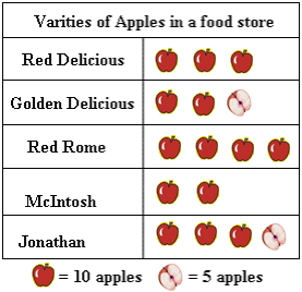
d. Pictograph

Advantage: It handles large data and it sets easily using keyed icons.
Disadvantage: It's hard to quantify partial icons.
2) How can graphs be misleading. Show 3 ways.
- Putting a break on the Y-Axis

- Distorting the visual

- Distorting the size of bars

3a) The following chart shows Pizza Sub Sales over a month. What 2 graphs would show the information accurately?

A line graph and a bar graph would show the data accurately.
3b) If you were selling Pizza Subs would you continue? How does your graph explain your answer.
Yes, I would continue selling Pizza Subs. This is my answer because when I look at it, it shows me that they are selling more and more every week.
4a) Below you see 2 different examples of graphs showing healthy choices sold at the canteen. If you had to convince Mrs. Mota that we should continue selling healthy choices which graph would you choose?

I would convince Mrs. Mota to use the Line Graph.
4b) Change each graph so that your information looks even MORE impressive. You may not change the data just the graphs.


Go to this link http://www.shodor.org/interactivate/lessons/MisleadingGraphs/ to help you understand more about misleading graphs.
and here's a video for you guys to help you learn more about misleading graphs
No comments:
Post a Comment
Note: Only a member of this blog may post a comment.