Bar Graph:


I would use a line graph and a bar graph
Advantage: It compares data across categories
Disadvantage: It may not be accurate because of the intervals
Double Bar Graph:
Advantage: It compares two sets of data across categories
Disadvantage: It can only compare two sets of data and it may not be accurate because of the intervals and what they are

Circle Graph:
Advantage: It compares data to the whole using percents
Disadvantage: You have to calculate to find out the percentage
Line Graph:
Advantage: It shows changes of data over time
Disadvantage: It only shows data that changes over time
Pictograph:
Advantage: It compares data that can be easily counted and is represented using pictures
Disadvantage: When the picture is cut it is hard to determine how much is cut off

2. How can graphs be misleading. Show 3 ways
-Put a break in the y-axis
-Distorting the visual
-Distorting the bar size
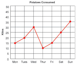
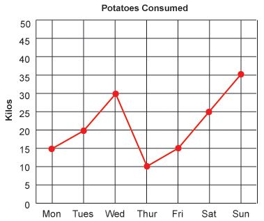
3a) The following chart shows Pizza Sub Sales over a month. What 2 graphs would show the information accurately?
I would use a line graph and a bar graph

3b)If you were selling Pizza Subs would you continue? How does your graph explain your answer.
If I were selling pizza subs I would continue because I have been selling more and more pizza subs each week, so if I continue there will be a better chance I will sell more
I would choose the pictograph to convince Mrs. Mota because it is easy to read and understand the graph.

4b)Change each graph so that your information looks even MORE impressive. You may not change the data just the graphs.


Here's a video to help you more about bar graphs......
No comments:
Post a Comment
Note: Only a member of this blog may post a comment.