Bar graph advantage- Compare data across categories.
Disadvantage- Sometimes it's inaccurate.

Double bar graph advantage- Compare two sets of data across categories.
Disadvantage- Can only compare two sets of data.
Disadvantage- Can only compare two sets of data.

Circle graph advantage- Best for comparing categories to the whole using percents.
Disadvantage- It is hard to compare two sets of data

Disadvantage- It is hard to compare two sets of data

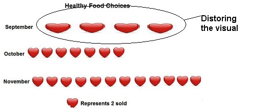
Pictograph advantage-Easy to read and can show data clear.
Disadvantage-Have to calculate to know data.


Line graph advantage- Shows the change in the data over time.
Disadvantage- Can only show one set of data.

2.How can graphs be misleading. Show 3 ways.
a) Distorting the size of the visual.
b)Making a break in the y-axis.

c)Distorting the size of the bars

Heres a video to help you with bar graphs.
No comments:
Post a Comment
Note: Only a member of this blog may post a comment.