Thursday, November 10, 2011

Diana's Graphing Post.

1)

Bar Graphs
Advantage- Bar graphs are best for comparing data across categories.
Disadvantage- The intervals are hard to identify.

Double Bar graphs
Advantage- Double Bar graphs are can compare two or three sets of data.
Disadvantage-Depending on the scale, the number of one category might be hard to identify.

Circle graphs
Advantage - comparing the part to whole.
Disadvantage - when the percents are close it would be hard to tell if it is the same or is it bigger or smaller.

Line graph
Advantage - Line graphs are the only graphs that compares data overtime.
Disadvantage- It can only show 1 set of data.

Pictographs
Advantage-Pictographs are easy to read.
Disadvantage- All of the pictures have to be the same size.

2) How are graphs misleading. show 3 ways.

distorting the scale.


distorting the visuals.


distorting the size of bars.


The following chart shows Pizza Sub Sales over a month. What 2 graphs would show the information accurately?


2b) The following chart shows Pizza Sub Sales over a month. What 2 graphs would show the information accurately?

a- A line graph and a bar graph would show information accuratley.


b- If you were selling Pizza Subs would you continue? How does your graph explain your answer.

I would continue selling Pizza Subs because the items sold each week is increasing. A line graph would show changes in the data over time and it would be going up


4. Below you see 2 different examples of graphs showing healthy choices sold at the canteen. If you had to convince Mrs. Mota that we should continue selling healthy choices which graph would you choose?


I would choose the line graph because it shows that the trend is increasing.

a) Change each graph so that your information looks even MORE impressive. You may not change the data just the graphs.


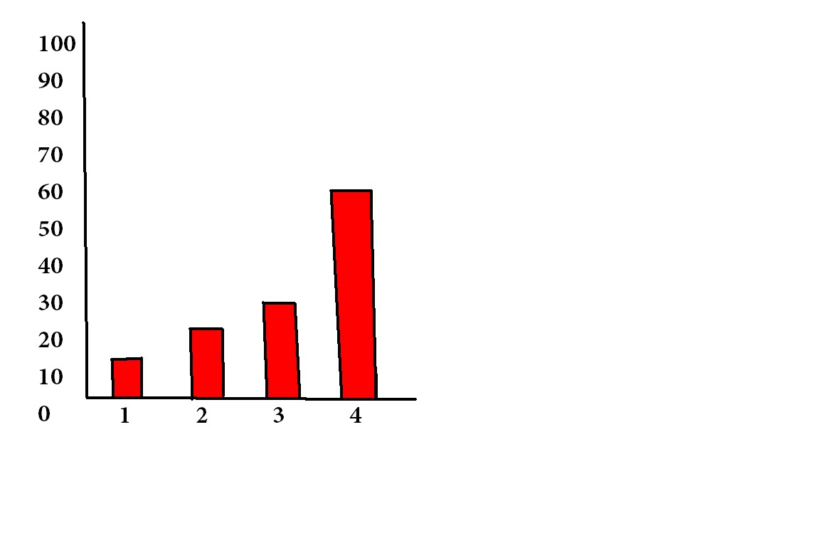


Ian's Graphing Post

1.) Line Graph-Advantage-The Advantage is it can compare multiple continuous data sets easily
Disadvantage- You can use it continuously

Bar Graph- advantage: it can compare large sets of dat
a easily.
Disadvantage- Graph categories can be reordered to
emphasize certain effects.

Double Bar Graph- Advantage-
Can compare multiple continuous data sets easily
Disadvantage-Use only with continuous data

Circle Graph- Advantage-

Pictograph-
Advantage -The advantage is it can compare large data sets easily using keyed icons
Disadvantage- It can only go up to 2-6 pictures.

2.) 1 way is the break in the y axis.
one of the bars are wider.
lastly the distorting of the visual.

2a) I would use line graph and bar graph

2b) yes because it would show how the pizza sub shop is improving in selling.
It explains because it showing the improvement.

4) I would use line graph because it shows more i
mprovement than the pictograph.

4a)


Beverly's Graphing Post

1. Use your notes to list the different types of graphs. Please list the advantages and disadvantages of each graph.


2. How can graphs be misleading. Show 3 ways.

-Distorting the scale.


-Distorting the visuals.


-Distorting the size of the bars.


3.a) The following chart shows Pizza Sub Sales over a month. What 2 graphs would show the information accurately?
A: I think that the bar graph and the line graph would show the information more clearly.


3.b) If you were selling Pizza Subs would you continue? How does your graph explain your answer.
A:Yes because each week the amount of items sold keep increasing.

4. Below you see 2 different examples of graphs showing healthy choices sold at the canteen. If you had to convince Mrs Mota that we should continue selling healthy choices which graph would you choose?

A: I would choose the line graph because you can tell that the line is going up which means that more people are buying more healthy choices.


4.a) Change each graph so that your information looks even MORE impressive. You may not change the data just the graphs.


Sheila's Graphing Post

1) Use your notes to list different types of graphs.Please list the advantages and disadvantages of each graph.


1a) Bar graphs: This are best for showing comparing data across categories.
Disavantage: This graph can only compare one set of data.
1b) Double Bar graphs: These are the best for comparing two sets of data across categories.
Disadvantages: You need 2 sets of data to use a double bar graph.
1c) Line graphs: Are best for showing changes in data over time.
Disadvantages: The line graph can only show one set of data.
1d) Circle graphs: Are the best for comparing categories to the whole using a percent.
Disadvantages : It's hard to compare 2 sets of data.
1e) Pictograph: This is the best for comparing data tat can be easily counted and represented using symbols.
Disadvantages: You have to calculate to know the data.


2) How can graphs be misleading. Show 3 ways.


3a) The following chart shows Pizza Sub Sales over a month. What 2 graphs would show the information accurately?
My answer: A line graph will show to data accurately.


3b) If you were selling Pizza Subs would you continue? How does your graph explain your answer.
Answer: Well if I was selling Pizaa Subs, I would keep on selling cause it is selling more and more each week.

4) Below you see 2 examples of graphs showing healthy choices sold at the canteen. If you had to convice Mrs.Mota that we should continue selling healthy choices which graph would you use?

Answer: If i was going to convice Mrs.Mota that we should keep on selling healthy choices, I would have to choose a line graph because it shows that students are buying healthy choices each month.


4a) Change each graph so your information looks even MORE IMPRESSIVE. You may not change the data just the graphs.


If you need more help here is a link to help you more on bar graphs.
And since there is something wrong with me uploading the video on to this post here is a link for it.


Raeesa's Graphing Post

Use your notes to list the different types of graphs. Please list the advantages and disadvantages of each graph.
1a)Bar Graph- this graph is good for comparing data across categories.
Advantages: compares data across categories
Disadvantages: it can only compare one set of data and depending on the intervals, it can be inaccurate


2)Double bar graph- this graph is good for comparing 2 sets of data across categories.
Advantages: it compares two sets of data across categories
Disadvantages: it can only compare a couple of data and depending on the intervals, it can be inaccurate

3)Line graph-this graph is good for showing changes in data over time.
Advantages: it compares changes in data over time
Disadvantages:the types of data mostly used are the ones that had changed over time


4)pictograph-this graph is best for comparing data that can be easily be counted and represented using symbols.
Advantage: it compares data that can be easily counted and represented using symbols
Disadvantage: when the symbols are cut, you can't tell how much of the symbol they have taken off

5)Circle Graph
circle graph's are best for comparing categories to the whole using percents.
Advantage: it compares categories (parts) to the whole using percents
Disadvantage: it takes a long time to make and very complicated to construct
2. How can graphs be misleading. Show 3 ways.
  • Putting a break on the y-axis
  • Distorting the visuals (making a visual,symbol larger than the rest)
  • Distorting the the size of a bar (making a bar wider,putting more area inside a bar.
3a. The following chart shows Pizza Sub Sales over a month. What 2 graphs would show the information accurately?

A line graph and a bar graph
3b. If you were selling Pizza Subs would you continue? How does your graph explain your answer.
Yes, I would continue selling Pizza Subs, because when I look at my graph, it shows me that they are selling more every week.

4a. Below you see 2 different examples of graphs showing healthy choices sold at the canteen. If you had to convince Mrs. Mota that we should continue selling healthy choices which graph would you choose?


I would choose the line graph because it looks like the canteen is selling more each month.

4b. Change each graph so that your information looks even MORE impressive. You may not change the data just the graphs.


Wednesday, November 9, 2011

Alyshia's Graphing Post

1. Different graphs may provide different information and display certain types of data better, like:


Bar graphs: are best for comparing data across categories


Double bar graphs: are best for comparing two sets of data across categories


Circle graphs: are best for comparing categories to the whole using percents. The sum of all the percents in a circle graph is 100%


Line graphs: are best for showing changes in data over time


Pictographs: are best for comparing data that can be easily counted and represented using symbols


2.


The 3 ways that a graph can be misleading is:


  1. distorting the scale

  2. distorting the size of bars

  3. distorting the visuals


2a) The following chart shows Pizza Sub Sales over a month. What 2 graphs would show the information accurately? The line graph and the bar graph will show the information more accurately.
2b) If you were selling Pizza Subs would you continue? How does your graph explain your answer. I would continue selling pizza subs because over the weeks the sales have been getting better and better.


3. Below you see 2 different examples of graphs showing healthy choices sold at the canteen. If you had to convince Mrs. Mota that we should continue selling healthy choices which graph would you choose? I would choose a line graph because it easily shows how the sales of the healthy choices at the canteen are getting better.
4a) Change each graph so that your information looks even MORE impressive. You may not change the data just the graphs.


My graphs that I think make the information more accurate.


This is a link that might help you if you are having problems:

Ronalen's Pay It Forward

Pay It Forward 2011-2012

Part 1

What is pay it forward?

Pay it forward is when you do and act of kindness for someone you do or don't know without expecting anything back. the main point of this is to make a difference no matter how big or small.
After you do the act of kindness you ask the person to pay it forward for another person and it just keeps going till it spreads out with many people paying it forward.

Part 2

My pay it forward act of kindness is to bake cookies for all the teachers in our school and tell them why we appreciate them. I chose to do this activity because teachers have hard days at school and I thought if we made them cookies and thank you cards it would lighten up their day a little bit and make them happy. We helped all the teachers in our school including the principal and vice-principals and the people in the office. We went to Kassey's house to make the cupcakes . We delivered the cupcakes on Monday to all the teachers and the EAs.

Part 3

The teachers were really happy to get the cupcakes and cards. We went at lunch to deliver the things to the teachers in the school. I felt absolutely stunned by how much this affected the day of the teachers we gave things to. I felt really happy to be making a difference in our teachers day. The teachers we happy to receive the cupcakes. We never asked the teachers to pay it forward because we had to rush to deliver the cupcakes so the other people in my group could go to choral fest.

Part 4

The idea of pay it forward is important because it shows other people capable of doing things for others for nothing in return. My act of kindness made a difference in the teachers day because it made a smile on their faces. It made the teachers happy and it brightened up their day a little bit.

Here is a slideshow that shows what we did for pay it forward.